|
I always find myself mesmerized with how graphics are used so excellently in presenting information through multimedia. This week's lecture covers the topic of principles in design, a crucial topic for me to better use my media platform to deliver information. There is five principles of design, the first one being color and contrast.  The right usage of color and how the colors are contrasted are important in attracting readers's attention to the information, besides helping them to remember better. The screenshot above is one of my favorite shots in The Shawshank Redemption movie, as it concludes the film in an analogous and complementing way. Next is repetition, where the usage of fonts and text sizes should be consistent, in order to better deliver information. Other than that is the alignment. Alignment plays an important role in ensuring audience to take note of the information delivered. Good usage of alignment can always be seen in award-winning movies, and the movie that I used as an example is Moonlight. 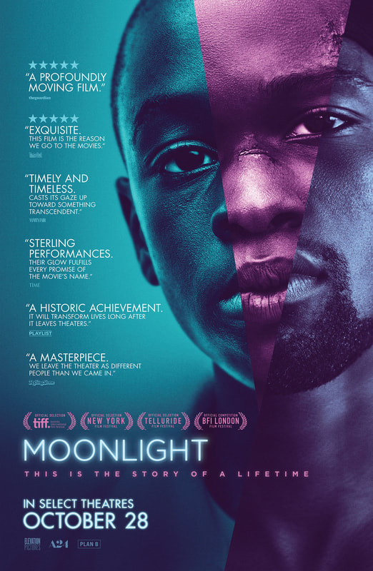 Last but not least in principles of design is proximity which focuses on the texts that are displayed in the media. The texts should be readable, with the spaces between letters and and spacing between lines being clear as it helps readers to focus more on the information delivered.
0 Comments
Leave a Reply. |
AuthorA human bean who likes to be in a horizontal state at all times if possible. Archives
December 2019
Categories |
 RSS Feed
